Too many operators and engineers rely on their SCADA and HMI displays for process feedback. While these outlets may be suitable for live, "in the moment" process management, they are not useful for process review, especially if you have access to a process historian. Just like game film is crucial to the success of an NFL quarterback, a solid data historian with strong trending solutions and process data analytics are a must-have if you hope to better your industrial process.
Adding Logic to the Calculated Trend
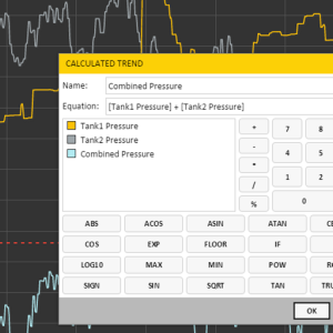
We have previously written about the Calculated Trend tool and how it allows you to better compare multiple data points and study correlations. If you have not begun to take advantage of this free Axiom tool, you should start doing so immediately. Any proper data historian system should be equipped with robust calculated trend tool.
If you need to watch a quick video on how to use this tool, take four minutes and watch this Canary University tutorial featuring the Calculated Trend.
Leveraging the IF Statement
To demonstrate the power of the IF statement, let's assume you are operating a piece of heavy machinery outdoors, and are concerned about the summer heat and it's potential effect on your equipment. You have several data points you are measuring, including air temperature, humidity, wind speed, cooling fan operation, and a engine temperature point.
To begin, you decide that you want to define a potential environmental threat. You do so by declaring that your equipment is at risk when the air temperature is over 90 degrees, the humidity is above 85, and the wind speed is below 5 miles per hour. You decide that you would like to measure the frequency in which the cooling fan is operating (off equals a value of 0 and on equals a value of 1) during these "at-risk" periods.
Using the Calculated Trend tool and the IF statement, you can create a calculated trend using the following occasion:
if([Cooling Fan Off/On]=0,if([Humidity]>85,if([Wind Speed]89.9999,[Cooling Fan Off/On],'!NODATA!'),'!NODATA!'),'!NODATA!'),'!NODATA!')
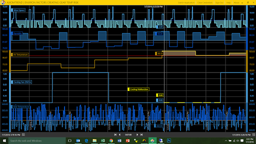
Once entered, you overlay the calculated trend onto the Cooling Fan chart and color it yellow. You can now easily visually differentiate when the "at-risk" conditions are present and the cooling fan is not operating.
This is helpful, but with the power of the calculated trend tool, there is no need to stop there. Let's go a step further and also overlay the gear temperature when it is above the 470 limit. To do this, I created a new Calculated Trend, specifically designed to capture the gear temperature readings only when all 3 environmental factors are at risk and only when the gear temperature is over 470 degrees. The formula looks like this:
if([Cooling Malfunction]=0, if([Gear Temperature]>470,[Gear Temperature],'!NODATA!' ) ,'!NODATA!')
I started the trend calculation and then dragged the new trend line up onto the Cooling Fan trend, setting the bottom scale of the Gear Temperature to 470 and locking it into place with the Cooling Fan's low scale of 0. The end result is a visual overlay of Gear Temperature when at risk directly on top of Cooling Fan when it is not operating. I added a limit with shading to make the trend stand out, and drilled down specifically on the time interval where the machinery was at risk.
If I wanted to take it one step further, I could again overlay this data directly on top of the Gear Temperature for further visual cues. Note, this is not the same as a high limit because I am specifically only interested in the high limit of 470 when it also coincides with my environmental "at-risk" period. Finally, I also added a time aggregate of the Gear Temperature at 2 minute intervals (orange) so I can also quickly compare the at risk Gear Temperature to the standard baseline.
This is just a simple example of a way you can quickly use logic in a calculated trend. How might you better understand your process if you applied similar concepts to your system? Want to try Axiom for free? Just let us know!