With the release of Version 19 expected within a few days, many have asked about new Axiom features. Axiom, Canary's trending and dashboarding tool, has been one of the most popular products Canary has ever released, and it continues to grow with three new features.
FEATURE #1 - LIVE SCROLL MODE
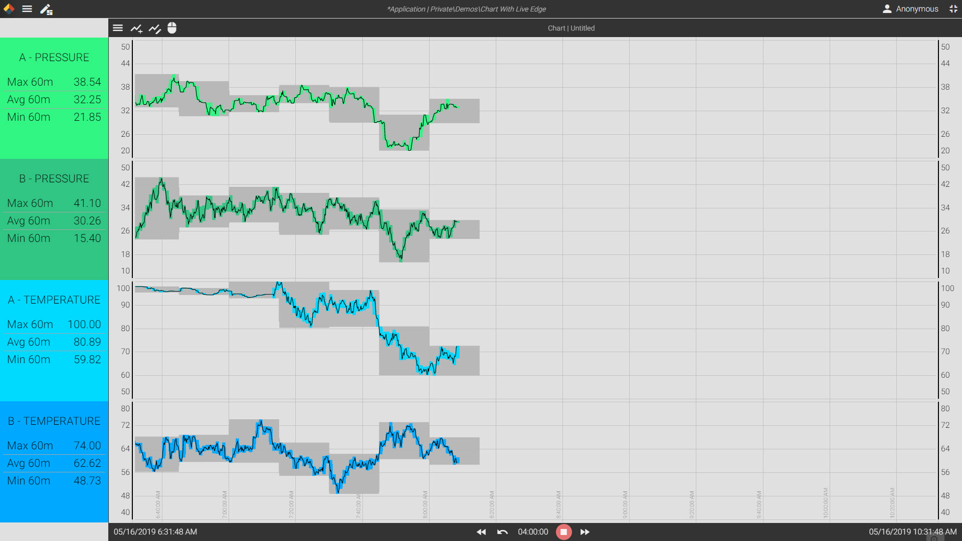
Some processes are more focused on what the live data values are than the historical values. For example, upstream oil and gas is heavily focused on current pressure values. A trend chart that is constantly in motion, or one that is always drawing values on the far right edge and sliding historical values towards the left side of the screen, can sometimes cause too much motion for operators to properly monitor the live edge. For this reason, Axiom now features a live scroll edge configuration. You can choose to have Axiom begin drawing live values from the far left of the screen and fill to the right edge. In fact, you have the ability to control where the live edge begins. The screen shot below illustrates the point perfectly. Three trends are banded together on four separate drawing rows. There is a raw data trend (black), as well as a one minute min/max trend (colored) and a fifteen minute min/max trend (grey). As new data fills on the screen, the trends will continue across the screen to the right edge. When it reaches the far right edge, the entire screen will shift once and begin drawing from the previous live edge location.
To access this new feature, use the hamburger menu of an Axiom Trend Graph, select Chart Options, and adjust "Live Scroll Percent".

FEATURE #2 - AUTOMATED REPORTING
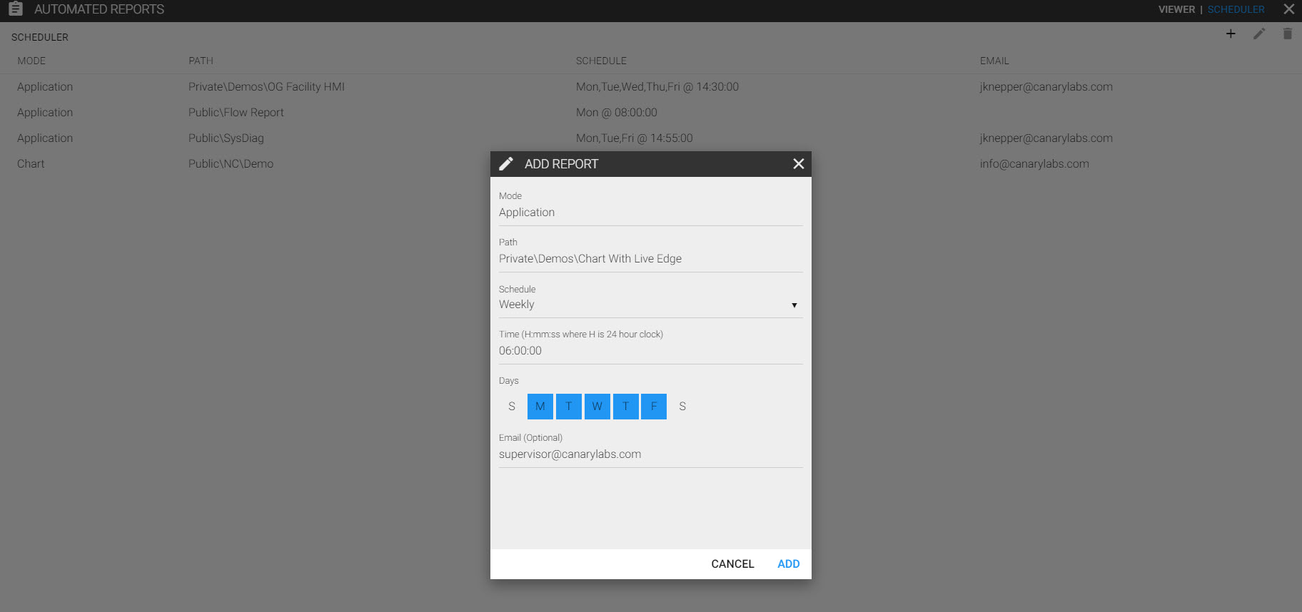
Another highly requested feature has been an automated reporting engine that can deliver scheduled screen captures of Axiom Trend Charts and Applications to users' inbox. With Version 19, that request has been fulfilled. Using the hamburger menu of any Axiom Application or Trend Chart will reveal a new feature, Reports. When you enter the Reports menu, you have two options, to view previously run reports, or to configure a new automated report instance using the "Scheduler".
It's simple to configure, just select any previously saved chart or application from your Public, Private, or Read-only folders. Then set the time and dates you would like the report to snapshot. Finally, enter an email address or addresses for distribution. As the reports run, they will archive under the "Viewer" section so you have a record of what went out each reporting cycle.

FEATURE #3 - ADJUSTABLE BANDING
If you like to constantly rearrange or adjust your trend bands on an Axiom Trend Chart, you will love this last feature. Adjustable banding will allow you to simply drag and adjust your trend locations on the chart. You can also quickly adjust your scaling by right clicking on the scales. These features are very intuitive and you can learn them in less than two minutes. Watch the quick demo video I made for more details.
If you would like to request Version 19 Download Links, let us know by contacting us directly:


